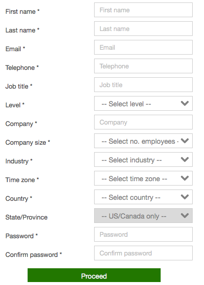
My inbox is filled with email promotions and once in a while I come across one for a webinar or content that looks interesting enough to register for. This was the case a few weeks ago for a vendor webinar featuring good speakers. However, after I clicked over to the landing page, I was faced with a 14 required question form to complete (screenshot below) -- note the asterisks for required info. Yes, this form is real and to protect the anonymity of the vendor, I’ve removed all references to their company information. I was interested in the webinar topic and would’ve registered, but exited the page in frustration instead.
Instead of lead generation, this company is unknowingly performing lead prevention.

As a marketer, I understand that for lead qualification and routing purposes, this company felt the need to cram all the info they needed onto one form, but they forgot the most important element - the customer’s experience. My guess is the overall conversion rate for this webinar was low.
It pains me to see marketers make these mistakes, so here are five tips when it comes to web form design:
- Use the KISS principle - For high valued content such as webinars, customers and prospects are willing to provide their information. The key is to apply the KISS principle (I’ll define it as Keep it Short & Simple vs Keep it Simple Stupid). Collect the basic information you need such as name, company name, email, but no more than 5-6 fields max for the best conversion rates.
- Add a contact augmentation service - determine what information you really need the prospect to complete versus utilizing a company/profile appending solution such as Data.com, DiscoverOrg, InsideView, Hoovers, etc. to round out the remaining information you need for lead qualification and routing. In this example, questions like company size, industry, country and state are all easy to find without asking the prospect, eliminating nearly 30% of the form questions.
- Leverage progressive profiling forms - Marketing automation systems like Hubspot, Marketo, Pardot, etc. have progressive profiling capabilities. These are intelligent forms where you can start with a series of short questions and as prospects engage and view more content, serve them additional questions.
- Test forms before launch - Review and test your form for any issues before turning them live. I've come across my fair share of broken forms where after completing the information it won't submit, so don't forget to test, test, then test again.
- Monitor and track conversion numbers - Review the landing page metrics multiple times per week. If your page abandonment rate is high (over 40%) this signals that you’ve received lots of visitors but they're not converting/registering.
Aim to strike a balance between gated (with a form) and un-gated (no form) content. Your goal is to create a continuous stream of engagement with the customer and if you gate every piece of content with a form, your conversion rates will suffer. Always consider the customer's experience first and ask yourself, would you want to spend time filling out this many required questions?
Remember marketers - your goal is lead generation, not lead prevention. Apply these tips and watch your conversion rates rise!


